



The Creation of the Spook Central 30th Anniversary Slimer Design by Dan Schoening

August 2026 marks 30 years since the creation of Spook Central, which is now the longest-running, still-active Ghostbusters website on the entire Internet... and parts of Belgium. To commemorate the occasion, some exclusive merchandise was released last week featuring a newly-commissioned 30th Anniversary rendition of Slimer drawn by fan-favorite artist Dan Schoening. Let's take a look at the creation of Slimer...
It all started on February 4, 2026 when I e-mailed Dan to discuss what plans I had to commemorate Spook Central's 30th anniversary. Like Dan Aykroyd, I think big, so my original plan was to create a set of 3 coins; one for each decade. Each would have the Spook Central SC logo/title and "30th Anniversary (1996-2026)" on the back, and a different ghost on the front. Slimer was a DEFINITE since he's been in the Spook Central logo since forever, but others could have been Gozer, Library Ghost, Terror Dog, Stay Puft or Mini Puft, Muncher, Garraka, or even a ghost from the Real or Extreme shows. My vision was to have the coins in a special case that holds all three side by side, sitting on a cushion or something. Below is my crudely-drawn rough mock-up for the coin design.
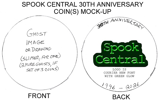
Needless to say, I had to scale back my idea to one single coin and no fancy case. So, now I just needed for Dan to draw a special 30th Anniversary rendition of Slimer to be used on the front of the coin, as well as elsewhere to mark the occasion. To start, we needed to figure out what pose Slimer would take. That same day, Dan suggested a pose similar to the one seen below, minus the Halloween candy. Dan also informed me that he was currently in the midst of a project, but that the art could be done by mid-March at the latest. I started this process early so that there would be no need to rush things for Dan, or for the coin company later on. (The horrible coin company delayed things so much later on that, despite starting everything so early that I should have had the final coins by July, I didn't have them until mid-August!)
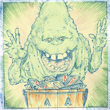
Dan and I were on the same wave-length about Slimer being "Ghostbusters 1 style". On March 17th, he sent along three thumbnails for me to peruse.
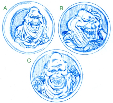
I opted for "C" because I thought it might work the best with the "hand 30" idea I had: his hands could make "30", with three fingers held up on the right hand and a circle-gesture ("zero") with the thumb and index finger on the left hand. That subtle hand gesture would make it specific for the 30th anniversary. The next day Dan sent along the first version of this idea.
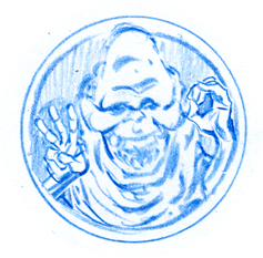
Before committing to this idea, I wanted to try one other thing first. I asked Dan if he could try drawing Slimer with his arms stretched out flying (same "30 hands"), like seen in the shot of him flying towards Peter in the hotel.
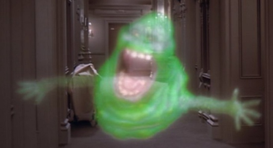
Dan sent back a two-fer, one that refined the original idea (left, below) and one that scoped out this new "arms stretched out" idea (right, below). Upon seeing the latter, I realized that the concept would NOT work in the round shape of a 2-inch coin. There is just too much empty space around him.
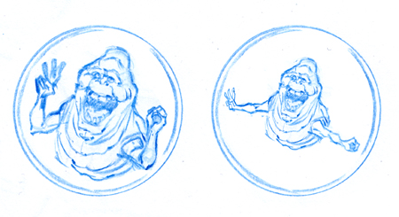
Dan created the near-final design on March 20th.
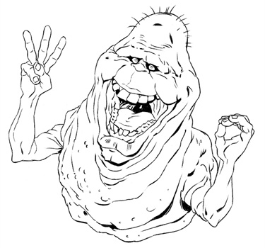
I thought he looked really good. My only feedback was to have Dan move his right eye just a tiny bit more to our left (his right). Not just because he would look a bit less cross-eyed, but I also thought that it would work better on the coin if there was a tad bit more space between the pupil and the corners of the eye socket. Since the pupils are a tiny detail, I wanted to make sure there would be less chance for them to get muddled when the coin company scales the art down and translates it to the coin mold. So, the next few revisions focused solely on eye changes.

Dan noticed that there was some artifacting on left eye...
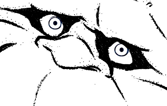
...so he sent back a revision that fixes it.

With that fixed, the final black and white design was created on March 26th.
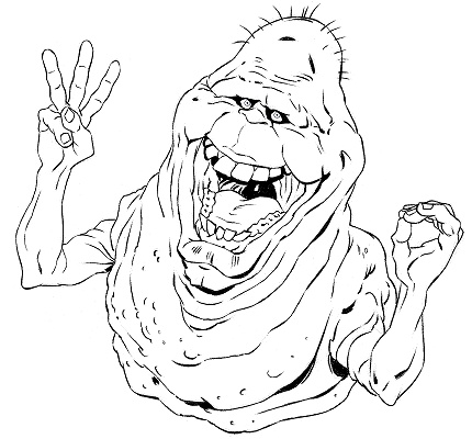
All that was left was to colorize the beautiful little spud. Dan sent that along on March 29th.

Fast forward several months and this is what Slimer looks like on the final coin.
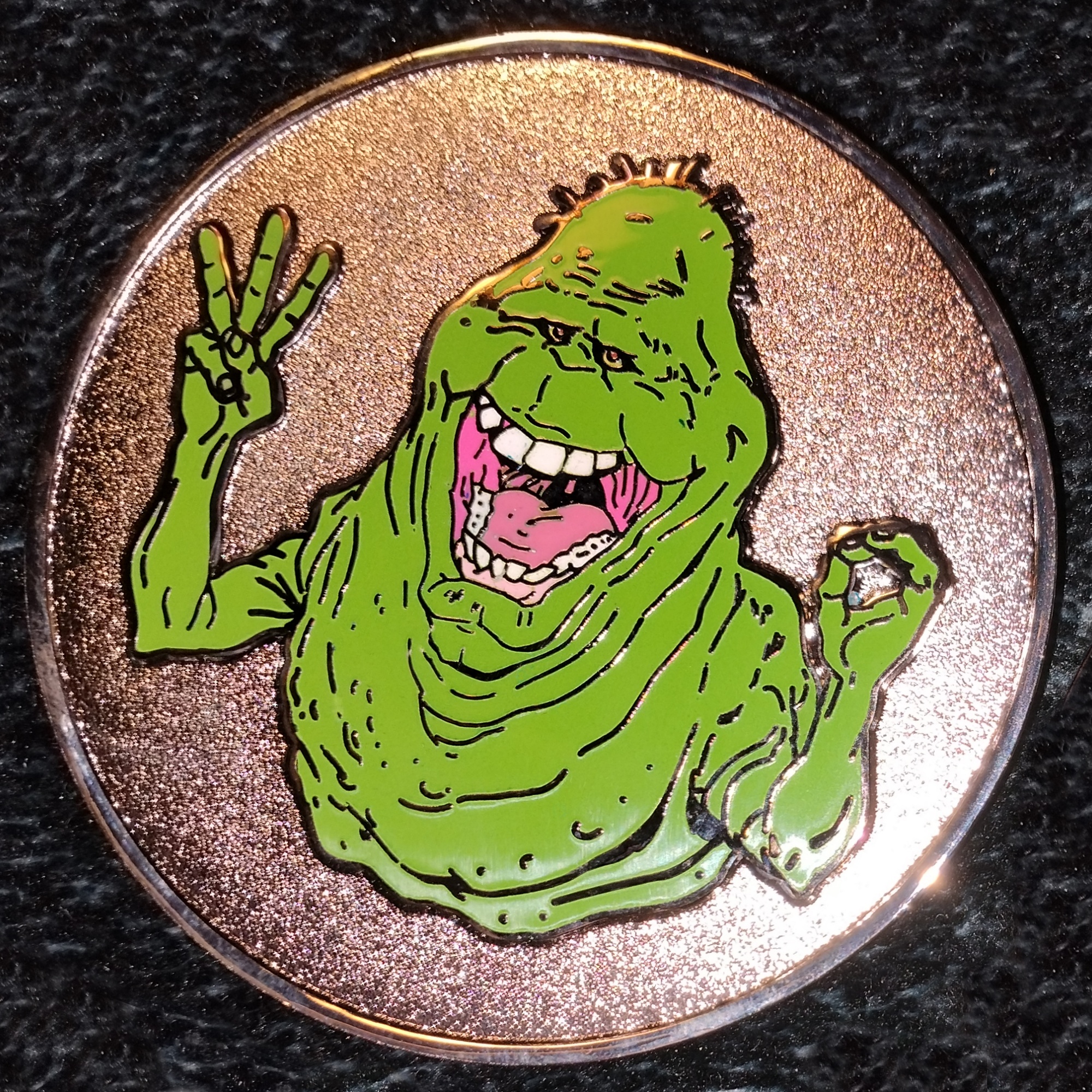
(click to enlarge)
This 2" metal coin features a subtle glow-in-the-dark effect on both Slimer and "Spook Central", giving the coin an extra spooky appearance! Click on the image below to order one in the Spook Central Shop, bundled with a free Afterlife and Frozen Empire poster set.
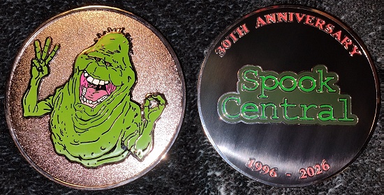
(CLICK TO ORDER)
This beautiful trinket is LIMITED TO A TOTAL PRODUCTION RUN OF 102 COINS. No more will ever be made because I will not deal with the horrible coin company ever again. Once they sell out, they will be gone for good.
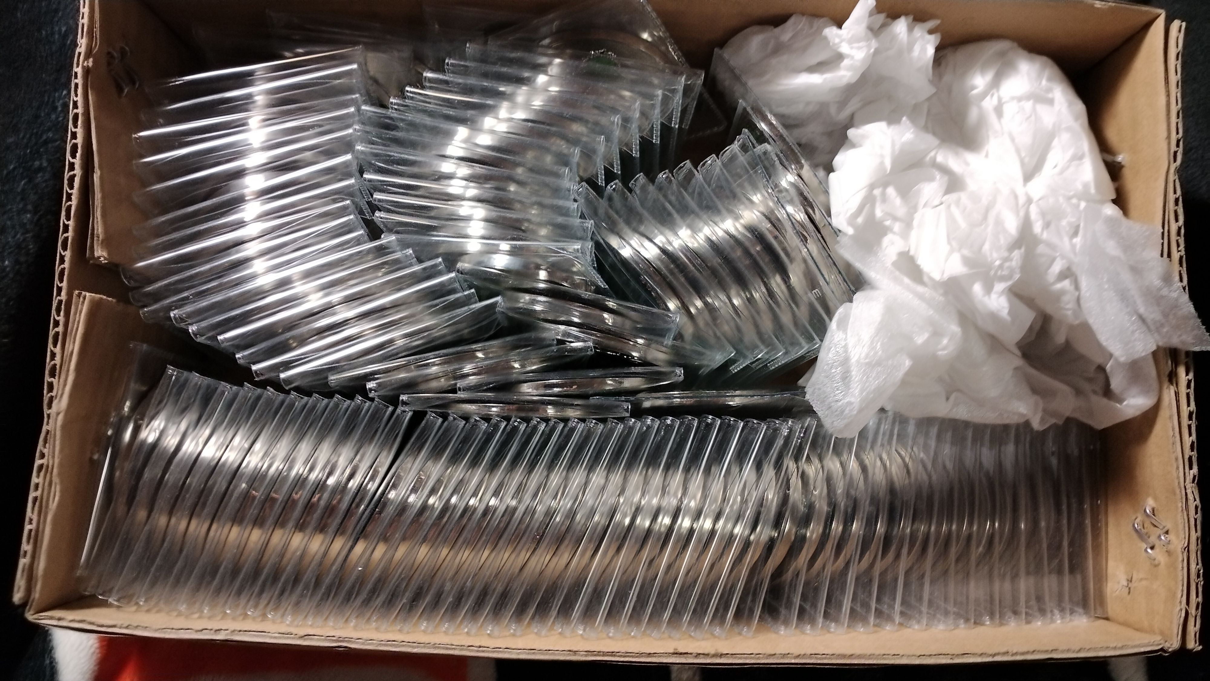
(click to enlarge)
I have also added the "Spook Central 30th Anniversary" design to my TeePublic store. This allows you to get it on a t-shirt, a magnet, a sticker, socks, shorts, fanny pack, ball cap, phone case, pin/button/badge, tote bag, coffee mug, and pillow. Hopefully you'll find something to your liking. Real photos of the actual t-shirt, magnet, and sticker that I ordered can be found in the 30th Anniversary post.
I have to admit, had I known what I was getting myself into, and how horrible the coin company would be, I probably would not have done this project, even though I really wanted to do something special for Spook Central's 30th Anniversary. The cost for the drawing wasn't so bad, though it did stretch things thin that month. On March 22nd, I paid Dan $127.00 USD ($167.00 CAD) for the drawing, and to have the original signed drawing and a signed IDW comic mailed to me. (I received the signed drawings and "Ghostbusters 101" #4 comic on April 8th.) The coin company charged me $698, which was a NIGHTMARE to gather up the funds to pay. Lots of skipped meals, cashing in cans and bottles, and just overall skimping and saving over several months just to make sure I would have the coins to sell to the general public and give away to select individuals. In total, this whole project cost me $825, and it will be a miracle if I make that back. So, please buy a coin or one of the ancillary products in the TeePublic shop. Thanks.
No feedback yet
Leave a comment