


Home   •   Films   •   TV Series   •   Everything Else   •   Help/Search   •   Credits/Contact   •   Shop   •   The Corner Penthouse

Ghostbusters Video Game - Opening Comparison

 By Paul Rudoff on Aug. 20, 2009 at 9:16 PM , Categories: Games
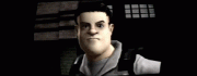
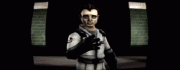
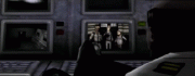
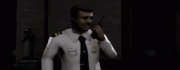
Here's a side-by-side image comparison of the shots that match up in the opening cinematic between the realistic (PC/PS3/X360) and stylized (PS2/Wii) versions of Ghostbusters: The Video Game. What's interesting is that in the stylized version, the opening cinematic doesn't give the year "1991" like in the realistic version, which means that theoretically the stylized version could take place at any time after Ghostbusters II. Videos of the two openings are up on YouTube: Realistic Version and Stylized Version. The Stylized shots below were pulled from the PS2, which is why they are of such low quality. The Wii gets a nice widescreen image, while the PS2 is stuck with letterboxing. Why? I don't know. The PS2 is capable of outputting in 16:9, but the developer chose to stick it in 4:3. I could go on this whole rant about how PS2 games that preceded Ghostbusters were capable of much more graphically and gameplay-wise with much shorter loading screens, but that's a rant for another day.

Realistic Stylized

2 comments

Comment from: Lanny D. Crepit [aka "Ectofiend"] [Visitor]

I still like the way the security guards look like in the stylized version better…They for more convincing guards to me…

And then there’s Egon’s extra line in the stylized version that helps sell it better…

Cheers.

Aug. 21, 2009 @ 20:33
Comment from: [Member]

Lanny, I feel just the opposite, but it’s due to the poor graphics in the stylized version. The guards in the realistic version actually look like real people. The guards in the stylized version look like poor PlayStation 1 graphics’ version of people. Just look at the stylized guard’s “hand” in the second to last shot up there. That’s not a hand, that’s a flipper!

Graphics aside, I’m split on which opening I like the best. I give the nod to the stylized version for the commercial, due to the extra line of dialog; but I give the nod to the realistic version for the remainder for having more shots and dialog.

Aug. 22, 2009 @ 14:54

Leave a comment


Click here to log in if you already have an account on this site.
Your email address will not be revealed on this site.
(Set cookies so I don't need to fill out my details next time)
(Allow users to contact me through a message form -- Your email will not be revealed!)


Who you gonna call?

Please answer the question above.
We ask for this in order to slow down spammers.
Sorry for the inconvenience.
Please log in to avoid this antispam check.

Search (Blog Articles Only)

  XML Feeds

Photo albums software